Overview
Bard is our recommended fieldtype for creating long form content from the control panel. It's highly configurable, intuitive, user-friendly, and writes impeccable HTML (thanks to ProseMirror).
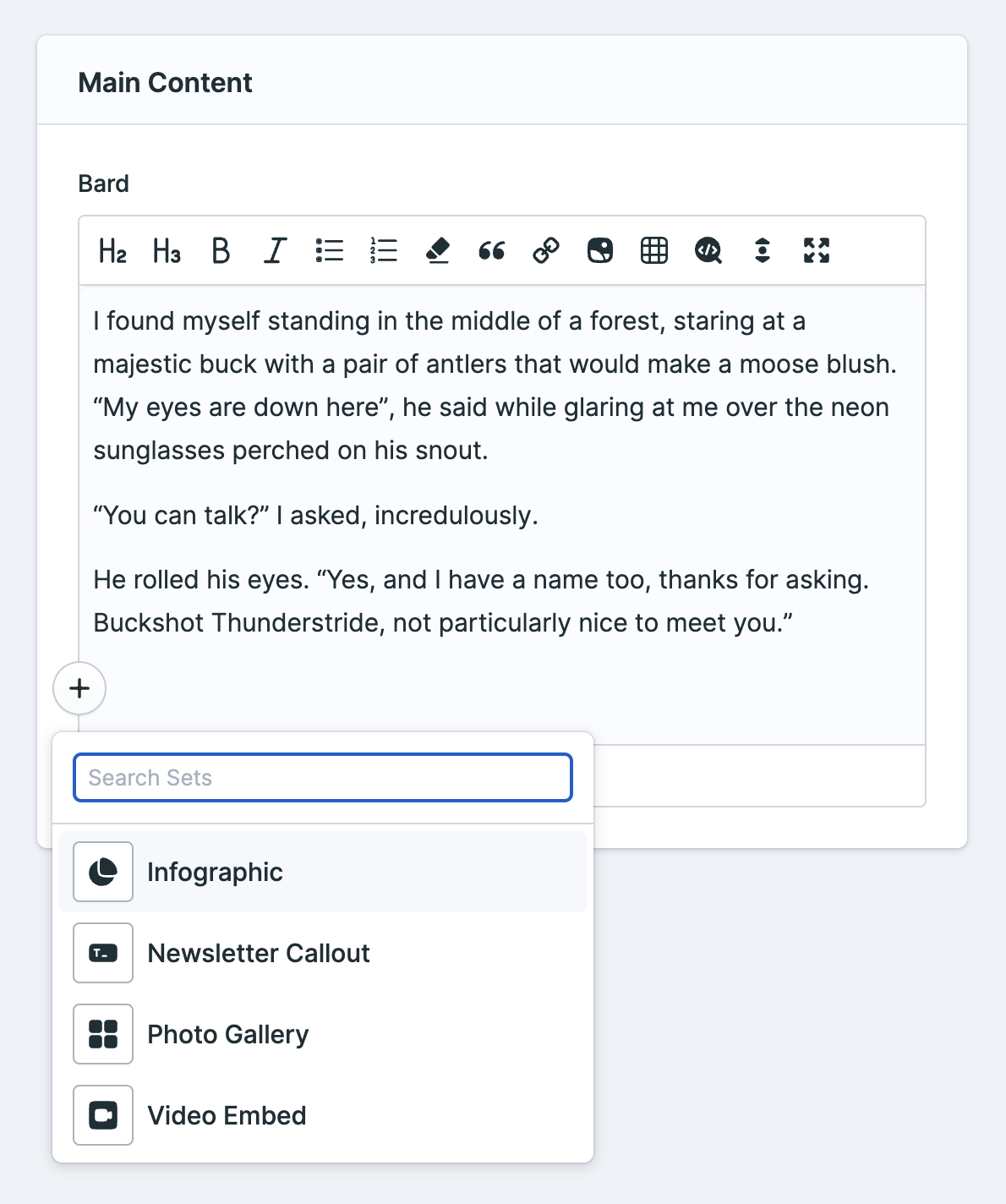
Bard also has the ability to manage "sets" of fields inline with your text. These sets can contain any number of other fields of any fieldtype, and can be collapsed and neatly rearranged in your content.
Working With Sets
You can use any fieldtypes inside your Bard sets. Make sure to compare the experience with the other meta-fields: Grid and Replicator. You can even use Grids and Replicators inside your Bard sets. Just remember that because you can doesn't mean you should. Your UI experience can vary greatly.
Data Structure
Bard stores your data as a ProseMirror document. You should never need to interact with this data directly, thanks to augmentation.
Templating
Without Sets
If you are using Bard just as a rich text editor and have no need for sets you would use a single tag to render the content.
{{ bard_field }}With Sets
When working with sets, you should use the tag pair syntax and if/else conditions on the type variable to style each set accordingly. Note: any content that is entered not in a set (i.e. your normal rich-text content) needs to be rendered using the "text" type. See the first condition using "text."
{{ bard_field }} {{ if type == "text" }} <div class="text"> {{ text }} </div> {{ elseif type == "poll" }} <figure class="poll"> <figcaption>{{ question }}</figcaption> <ul> {{ options }} <li>{{ text }}</li> {{ /options }} </ul> </figure> {{ elseif type == "hero_image" }} <div class="heroimage"> <img src="{{ hero_image }}" alt="{{ caption }}" /> </div> {{ /if }} {{ /bard_field }}An alternative approach (for those who like DRY or small templates) is to create multiple "set" partials and pass the data to them dynamically, moving the markup into corresponding partials bearing the set's name.
{{ bard_field }} {{ partial src="sets/{type}" }}{{ /bard_field }}resources/views/partials/sets/ gallery.antlers.html hero_image.antlers.html poll.antlers.html text.antlers.html video.antlers.htmlExtending Bard
Bard uses TipTap (which in turn is built on top of ProseMirror) as the foundation for our quintessential block-based editor.
Custom set icons
You can change the icons available in the set picker by setting an icons directory in a service provider.
For example, you can drop this into your AppServiceProvider's boot method:
use Statamic\Fieldtypes\Sets; public function boot(){ Sets::setIconsDirectory(folder: 'light');}Alternatively, if you want to use a different base directory altogether, you can do this:
Sets::setIconsDirectory(directory: resource_path('custom-icons'));Options
allow_source
Controls whether the "show source code" button is available to your editors. Default: true.
sets
An array containing sets of fields. If you don't provide any sets, Bard will act like a basic text/WYSIWYG editor and you won't see the "Add Set" button.
buttons
An array of buttons you want available in the toolbar.
You can choose from h1, h2, h3, h4, h5, h6, bold, italic, small, underline, strikethrough, unorderedlist, orderedlist, removeformat, quote, anchor, image, table, code (inline), codeblock, and horizontalrule.
These are the defaults:

When you have the image button toggled, make sure to define an Asset Container in the Bard field's settings, otherwise the button won't show.
target_blank
Automatically add target="_blank" on links by default. You'll be able to override this per-link. Default: false.
link_noopener
Set rel="noopener" on all created links. Default: false.
link_noreferrer
Set rel="noreferrer" on all created links. Default: false.
fullscreen
Enable the option to toggle into fullscreen mode. Default: true.
collapse
Expand (true) or collapse (false) all sets by default. Default: false.
container
An asset container ID. When specified, the fieldtype will allow the user to add a link to an asset from the specified container.
inline
Switch the field to inline mode. Block elements such as sets, headings and images are not supported in inline mode and should not be enabled.
toolbar_mode
Choose which style of toolbar you prefer, fixed or floating. Default: fixed.
reading_time
Show estimated reading time at the bottom of the field. Default: false.
word_count
Show the word count at the bottom of the field. Default: false.
save_html
Save as HTML instead of structured data. This simplifies templates so you don't need to loop through the structured nodes. Only works while no sets are defined. Default: false.
always_show_set_button
Always show the "Add Set" button. Default: false.